
The iceberg chart is typically created using a stacked bar chart or stacked area chart, with the visible portion representing the top of the iceberg and the hidden portion representing the majority of the data that lies beneath the surface. This allows the viewer to quickly identify the most important data collection points, while also providing context for the smaller data points. One of the main advantages of using an iceberg chart is that it allows the viewer to quickly identify sample patterns and trends in the data. For example, if a chart shows that a majority of the data points are concentrated in a certain area, the viewer can quickly identify that as a trend.
6+ Iceberg Chart Samples
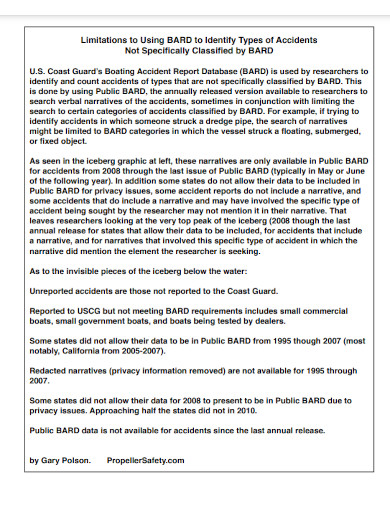
1. Iceberg Chart Template
2. Hands-on session on Iceberg Charts
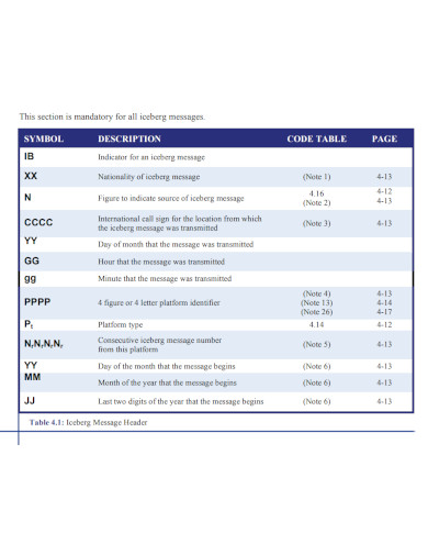
3. Iceberg Chart Message
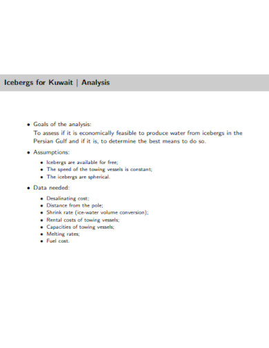
4. Diversity Iceberg Chart

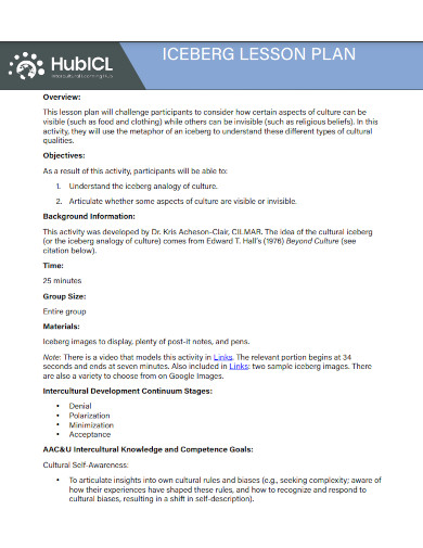
5. Iceberg Lesson Plan Chart
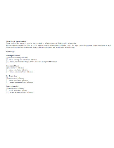
6. Iceberg Chart Detail Questionnaire
7. Automated Iceberg Chart

What Is an Iceberg Chart?
An iceberg chart is a type of data visualization that is used to represent a large proportion of hidden data (the “iceberg” part) that lies beneath a small visible portion. It is typically used to show the relative importance of different data points in a set by displaying the largest data points as a visible portion and the smaller data points as the hidden portion. The chart is typically created using a stacked bar chart or stacked area chart, with the visible portion representing the top of the iceberg and the hidden portion representing the majority of the data that lies beneath the surface.
How To Make an Iceberg Chart?
Another advantage of using an iceberg chart is that it can be used to represent a large amount of data in a small space. This is particularly useful when working with large data sets that would be difficult to display in a traditional bar chart or line chart. Creating an iceberg chart typically involves the following steps:
Step 1- Gather and Determine Data
Gather the information you wish to display in an orderly fashion, such as by using a spreadsheet or a database. Visualization is a powerful tool. Make a decision regarding which data points will be displayed in the portion of the iceberg chart that is visible. In most cases, this will consist of the largest or most significant data points in the set.
Step 2- Create Chart
Create a stacked bar chart or stacked area chart by using a spreadsheet or some other type of data visualization software. The part of the chart that is visible will stand in for the tip of the iceberg, while the part of the chart that is hidden will be a representation of the vast bulk of the data that is concealed below the surface.
Step 3- Customize Chart
To make the chart more informative and appealing to the eye, you could give it some labels, change the colors, or add other visual components.
Step 4- Interpret the Chart
Once the chart is created, analyze it to identify patterns and trends in the data. You may also use it to determine which data points stand out as unusual and to draw comparisons between the various points.
How is an iceberg chart created?
An iceberg chart is typically created using a stacked bar chart or stacked area chart, with the visible portion representing the top of the iceberg and the hidden portion representing the majority of the data that lies beneath the surface. It can be created using blank spreadsheet software like Excel or data visualization software like Tableau.
What are the advantages of using an iceberg chart?
The main advantages of using an iceberg chart are that it allows the viewer to quickly identify patterns and trends in the data and can also be used to identify outliers. Additionally, it can be used to represent a large amount of data in a small space, making it an ideal tool for working with large data sets.
Can an iceberg chart be used for any type of data?
An iceberg chart is typically used for data sets that have a few large data points and many smaller data points. It’s not recommended for data that is homogeneous or have similar size data points.
In conclusion, an iceberg chart is a powerful data visualization tool that can be used to display a huge quantity of data in a manner that is succinct and simple to comprehend. This can be accomplished in a variety of ways. It enables the viewer to rapidly recognize patterns and trends within the data, and it can also be used to recognize outliers in the data. Additionally, it is possible to represent a vast quantity of data in a short space, which makes it an ideal tool for working with enormous data sets because of its compact representation capabilities.
Related Posts
FREE 10+ Pie Chart Samples in PDF
Free 3+ Eye Color Chart Samples in PDF
FREE 10+ Family Chore Chart Samples in PDF
FREE 10+ Classroom Chart Samples in PDF
FREE 10+ Genealogy Chart Samples in PDF
FREE 10+ Shipping Chart Samples in PDF
FREE 10+ Goal Chart Samples in PDF
FREE 10+ Character Chart Samples in PDF
FREE 10+ Table Seating Chart Samples in PDF
FREE 10+ Classroom Seating Chart Samples in PDF
FREE 10+ Grade Chart Samples in PDF
FREE 10+ Workflow Chart Samples in PDF
FREE 10+ Budget Chart Samples in PDF
FREE 10+ Process Flow Chart Samples in PDF
FREE 10+ Medication Chart Samples in PDF | DOC