
A circle with regions, or slices, is referred to as a pie chart. A slice represents the count or percentage of observations at each level for the variable. In company business, pie charts are frequently utilized. Examples include displaying the percentage of various consumer kinds, sales business report from various product management, and profit and loss from various nations. When there are few levels, pie charts can be useful for illustrating how the parts relate to the whole.
10+ Pie Chart Samples in PDF
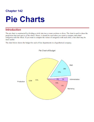
1. Pie Chart Example
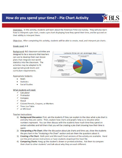
2. Pie Chart Activity
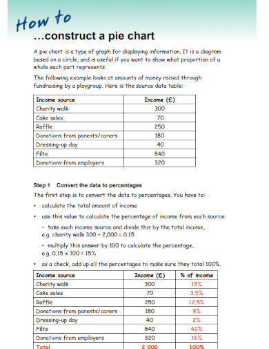
3. Construct a Pie Chart
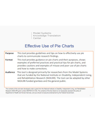
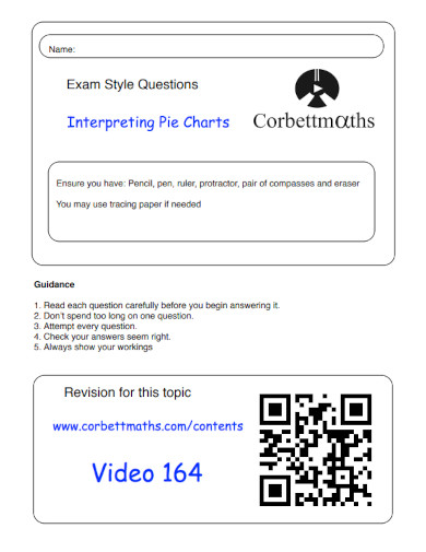
4. Effective Use of Pie Charts
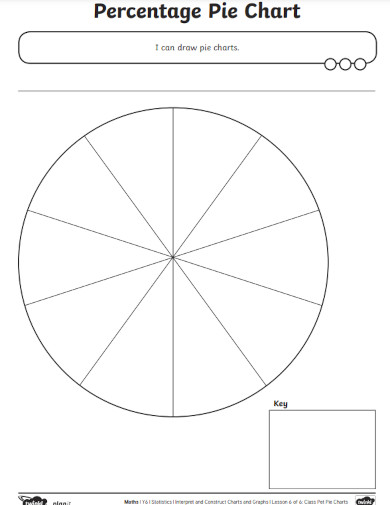
5. Percentage Pie Chart
6. Drawing Pie Charts
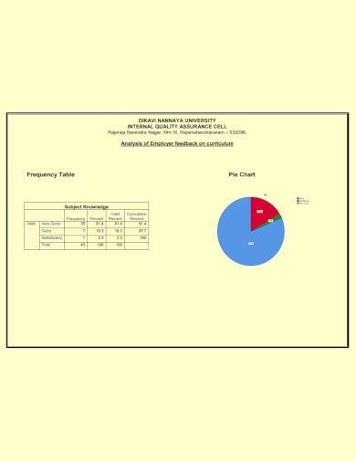
7. Frequency Table Pie Chart
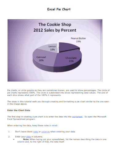
8. Excel Pie Chart
9. Reading Pie Chart
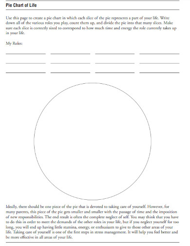
10. Pie Chart of Life
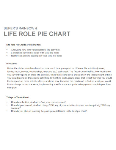
11. Life Role Pie Chart
What Is a Pie Chart?
A Pie Chart is a type of graph that shows data in a circular graph. The graph’s components are sized according to how much of each category’s total there is. In other words, each piece of the pie is proportional to how big that category is overall in the group. Pie “slices” symbolize sections of the whole, whereas the full “pie” represents 100% of the whole.
How To Make a Pie Chart?
We use pie charts whenever some data needs to be represented graphically as a small portion of a larger whole. To compare the data and determine why one is smaller or greater than the other, it is employed. It is therefore preferable to utilize a pie chart when working with discrete data sets and a small number of bins. You can read and follow the steps below to learn how to make a pie chart.
1. Gather Your Data
The relative size of a number of distinct data categories can be compared with the use of pie charts. Pie charts function most effectively when displaying nominal or ordinal data, in which there are six categories or fewer in total. If there are more than six categories, some pieces of a pie chart may be too small to read and understand without making an unnecessary effort.
2. Calculate Total Value
Perform the calculation to get the overall value of the data. This sum represents the total amount of data points at your disposal. If you only asked one question in your survey, the total number of replies you got would serve as the total number of data points in the analysis.
3. Calculate The Ratio
Determine the ratio of each category using the calculator. To calculate a ratio, simply divide the total number of replies that one specific category received by the total number of data points. To convert this into a percentage, divide the numerator by the denominator and the result will be the percentage.
4. Draw a Circle
To create a circle, you should make use of a compass. Attach a pencil that has been sharpened, and when swinging the compass to create a circle, be sure to grip the point of the pencil firmly. It makes no difference how big the circle is, but keeping in mind that the bigger the circle is will make it simpler to make and read your pie chart.
What exactly is a PDF pie chart?
A circle is first divided into two or more portions or slices, and then the circle is used to make a pie chart. The chart is used to illustrate in what percentage each component is comprised of the entire.
What is the degree of tilt of the pie?
The total angle at the center of a pie chart is always 360 degrees because the chart is in the shape of a circle.
What is the first step in creating a pie chart?
Create a circle with a radius of your choosing. Drawing radii involves beginning with the horizontal radius and making center angles that match the values of individual components. Radii are then drawn.
The year-over-year sales of a company can be presented in the form of a pie chart. They present the data to you in a way that is easy to understand, and you can see it. The primary purpose of these charts is to display comparisons. In schools, the amount of time that is dedicated to each subject is broken down using pie charts. In addition, we may use pie charts to get an annual breakdown of our expenditures.
Related Posts
FREE 5+ Pert Chart Samples in PDF
FREE 8+ Blood Type Chart Samples in PDF | DOC
FREE 10+ Medicine Chart Samples in PDF | MS Word
FREE 10+ Seat Chart Samples in PDF
Free 3+ Eye Color Chart Samples in PDF
FREE 10+ Family Chore Chart Samples in PDF
FREE 10+ Classroom Chart Samples in PDF
FREE 10+ Genealogy Chart Samples in PDF
FREE 10+ Shipping Chart Samples in PDF
FREE 10+ Goal Chart Samples in PDF
FREE 10+ Character Chart Samples in PDF
FREE 10+ Table Seating Chart Samples in PDF
FREE 10+ Classroom Seating Chart Samples in PDF
FREE 10+ Grade Chart Samples in PDF
FREE 10+ Workflow Chart Samples in PDF