
There are all kinds of businesses and organizations in our modern world. We have law firms, food suppliers, fashion companies, software developers, and vehicle dealerships, just to name a few. Across all these different industries, you can carry out tasks more efficiently with the help of various tools and materials. Some of these resources include but are not limited to a dashboard, roadmap, mind map, flowchart, slideshow, and spreadsheet. One of the more flexible examples is column charts, which are simple yet powerful infographic charts that use simple bar graphics or line graphics for measuring data. Are you looking to put together a column chart quickly and easily? If so, download any of the listed PDF samples below.
5+ Column Charts Samples
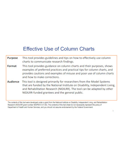
1. Effective Use of Column Charts
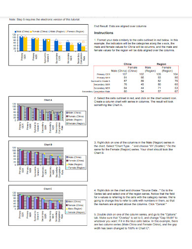
2. Dot and Columns Chart
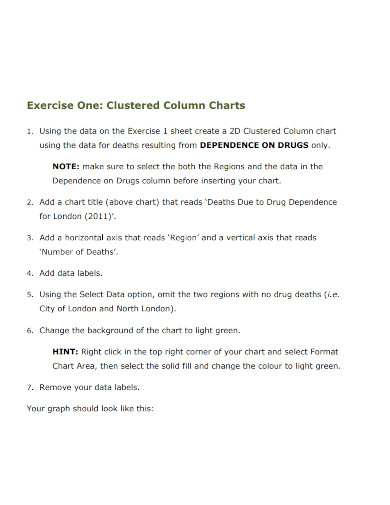
3. Clustered Column Charts
4. Six-Column Chart
5. Two-Column Chart
6. Three Column Chart Template
What Is a Column Chart?
You can find a wide array of work that involves gathering or processing data. Properly handling such information requires close attention to detail and diligent documentation. Fortunately, we have various resources that help us fulfill such tasks. There are tools like company flowcharts, income spreadsheets, agile roadmaps, HR dashboards, and development mind maps. When it comes to making a comparison between different overlapping data using simple yet distinguishing visuals, that’s where column charts work well. A column chart uses stacked bars or lines to measure and compare data. From survey statistics to company expenses, you can incorporate a column chart for many purposes. You can even implement a column chart for personal or everyday use. To prepare a column chart of your own, you need a software application that allows you to create and edit a digital chart or graph. If you need to make a column chart by yourself, read through our guide below.
How to Make a Column Chart
1. Create a Column Chart Using a Suitable Program
Before putting together a column chart, you need a word-processing program or spreadsheet program installed on your computer. You can pick from a wide range of software for making a column chart perfect for your needs in this day and age. If you prefer working on a Windows system, both MS Word and MS Excel are perfect for creating a column chart. For a Mac desktop, you can take advantage of either Apple Pages or Apple Numbers. Lastly, opt for Google Docs on your web browser when you need an app available on any platform without installation.
2. Assess the Data to Add to Your Column Chart
The main content of a column chart is the data. When composing your graph, consider how to measure the data categories and how they relate or contrast with each other. Align each data category next to each other along the bottom of the sheet after assessing them. Optionally, you can create rows of ascending milestones or metrics starting from the bottom and going to the top.
3. Ensure Comprehension in Your Column Chart
One of the advantages of using a column chart is that readers have an easier time understanding how the data categories compare to each other at a glance. To design a creative and comprehensive column chart, incorporate multiple colors in the text and graphics. You should also allow adequate spacing between different elements. Finally, also consider font size and column width.
4. Expedite Your Column Chart Using Samples
Composing a column chart tends to take up a fair amount of time. So, to help you expedite your creation process, download a ready-made sample template. You can find content-filled templates for reference or blank templates for editing. And if you need to hop between different operating systems, use a PDF sample for flexible compatibility.
FAQs
What are the differences between bar charts and column charts?
Visually, bar charts are oriented horizontally, while column charts are oriented vertically, but due to their different orientations, their functions are not interchangeable.
Where do you use bar charts and column charts?
Bar charts are suitable for categories with long labels, while column charts are for data within a timeframe.
What is a column histogram?
Histograms are column charts that outline highly detailed data information.
Whether it’s for business, educational, or personal use, column charts are great for multiple applications. So, when designing one on your own, download a ready-made PDF sample for your convenience.
Related Posts
FREE 10+ Warehouse Management Samples in PDF | DOC
FREE 7+ Investment Management Contract Samples in PDF | MS Word
FREE 13+ Credit Risk Management Samples in PDF | MS Word
FREE 5+ Brand Risk Management Samples in PDF | DOC
5+ Forex Risk Management Samples in PDF | DOC
FREE 15+ Site Investigation Report Samples in PDF | DOC
FREE 5+ Venture Capital Risk Management Samples in PDF | DOC
FREE 5+ Investigation Log Samples in PDF | DOC
FREE 6+ Inventory Risk Management Samples in PDF | DOC
FREE 10+ Distribution Channel Strategy Samples in PDF | MS Word
FREE 8+ Retail Employee Handbook Samples in PDF | DOC
FREE 10+ Retail Return Policy Samples in PDF | DOC
FREE 9+ Predict Inflation Samples in PDF | MS Word
FREE 5+ Consultant Work Contract Samples in PDF | MS Word
FREE 10+ Consultant Contract Agreement Samples in PDF | MS Word