Data analysis and visualization are some of the most essential aspects of effective project management. Statistic worksheets, graphic designs, and other visualization tools enable better and easier communication and collaboration for every team member involved in a project. An agile burndown chart is a simple and effective tool to graphically illustrate how a team will be working by visualizing and plotting user stories against its time framework. A burndown chart can also be used to document the working pace of the team called velocity and predict their work performance.
3+ Agile Burndown Chart Samples
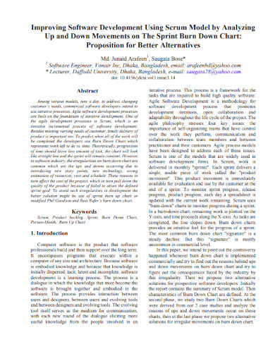
1. Software Development Agile Burndown Chart
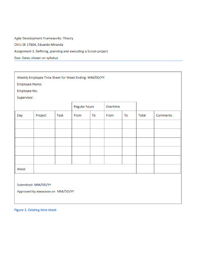
2. Agile Development Burndown Chart
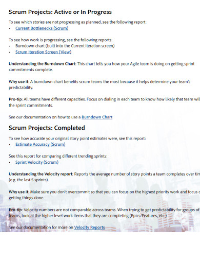
3. Agile Reporting Burndown Chart
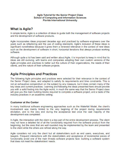
4. Principles and Practices Agile Burndown Chart
What Is an Agile Burndown Chart?
An agile burndown chart is a tool used by agile teams for data collection and analysis on the work they have completed and the tasks they have yet to complete within the timeframe they have given. It is a visualization tool used to tell how a project is progressing in a certain period and how much was completed during an iteration. This chart is also used as a prediction tool that enables agile teams to visualize the time when their project will be accomplished. With this visualization, teams are provided with insights into challenges during the process which allows them to determine appropriate solutions to these bottlenecks, leading to positive outcomes.
How to Create an Agile Burndown Chart
A burndown chart can serve as a simple scoreboard that visually represents your project management team’s development over a certain period and analyze their pace and determine whether they are progressing according to their timeline, how much work they have to finish, and how well they are performing the tasks. The project management team can also determine the delays in the project, allowing them to collaborate and brainstorm to come up with action plans.
Step 1: Determine the Remaining Work
The agile burndown chart represents the remaining work that the team needs to complete within a specified time. Using a backlog, they can determine the tasks to be done and judge how much work can they accomplish. The remaining work to be done can be represented by drawing a vertical line to the left side of your canvas.
Step 2: Include the Remaining Time
Draw a horizontal line at the bottom of your canvas as a representation of the time remaining to complete your work. It can be measured in days, hours, sprints, or more. This will help your team determine what tasks need to be done and how long each task should take to complete.
Step 3: Provide the Ideal Effort
The ideal effort refers to how the chart will look if the estimated work is accomplished according to its timeframe. Make a starting point in your remaining work vertical line, mark a finishing point to the time remaining line, and draw a horizontal line from one point to another.
Step 4: Track your Daily Progress
As you make progress every day, your team must update and plot the development against the remaining work. This detail will represent the actual effort to the ideal effort.
FAQs
What are the essential components of an agile burndown chart?
An agile burndown chart contains essential components such as a horizontal axis to represent the days of the sprint, a vertical axis to represent the finished tasks, and two lines that each represents the ideal work and actual work.
What are the two types of burndown charts?
A burndown chart has two types which are the sprint burndown chart used for the work remaining in an iteration and the product burndown chart which illustrates the work remaining for an entire project.
What are the benefits of using an agile burndown chart?
With an agile burndown chart, project management teams are provided with a direct comparison between the tasks that need to be done and the effort to be completed, enables the team to work on the same page by using one source of information, and gives them insight into their team productivity which also allows them to create a development plan when necessary.
An agile burndown chart is a management tool to visualize the progress of work or tasks which tells management teams whether their actual remaining work is ahead or behind the ideal work remaining line. By using a burndown chart, you will be able to visualize how your work is developing, gets every team member involved with the progress, allows your team to determine areas that need improvement, and provides you with an effective progress-tracking tool.
Related Posts
Sample Material Lists
Sample Excuse Letter for School
Feature Writing Samples
FREE 14+ Sample Music Concert Proposal Templates in MS Word | Google Docs | Pages | PDF
FREE 10+ Security Guard Contract Samples in PDF | MS Word
FREE 10+ Assurance Agreement Samples In MS Word | Google Docs | Apple Pages | PDF
FREE 10+ Option to Purchase Agreement Samples in MS Word | Apple Pages | PDF
FREE 26+ Curriculum Form Samples in MS Word | PDF
FREE 20+ Cleaning Service Proposal Samples in PDF | MS Word
FREE 29+ Sample Loan Application Form Templates in MS Word | PDF
FREE 10+ Event Venue Contract Samples in PDF | MS Word | Pages | Google Docs
FREE 10+ SBAR Samples in PDF | DOC
FREE 12+ Music Band Contract Templates in PDF | MS Word
FREE 10+ HVAC Maintenance Contract Samples in PDF | MS Word
FREE 10+ Social Media Marketing Contract Samples in MS Word | PDF


