Are you one of those people who work best under pressure and leave all the work for the last minute? Then our burndown chart templates that are available in Word and Excel formats are just the things for you! These Chart Templates contain space for filling in the amount of time left for you to complete your work as well as the amount of work you have left to complete.
These well-crafted templates are absolutely free of cost, can be downloaded quickly and easily and can be printed out and kept handy in either black and white or color as per your preference.
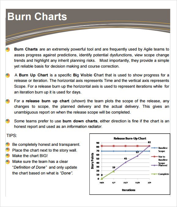
Burndown Chart Example
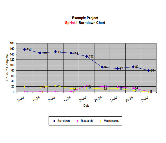
This sample of burn down chart example is designed in the form of a line graph. The x axis is plotted using the hours left for completing a job, while thee y axis depicts the various dates in the month on which the work needs to be down. A neatly plotted line graph shows the variation of time and work left to be completed.
Simple Burndown Chart Template
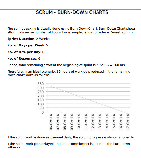
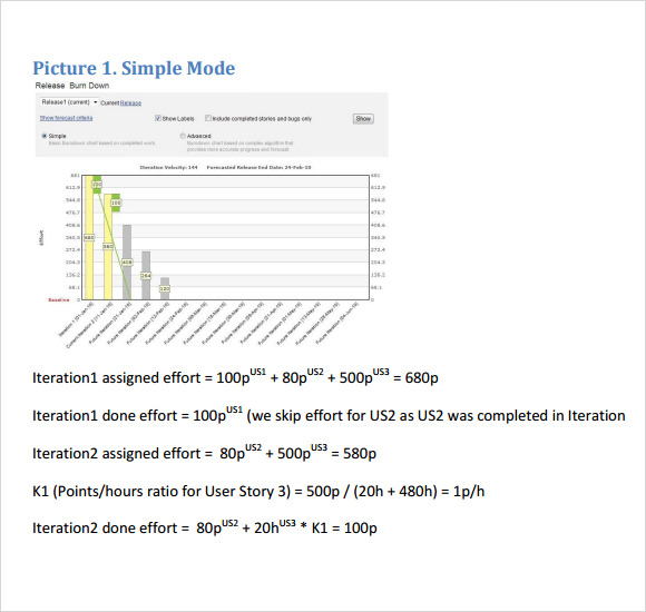
This sample of burn down chart template is a bit more elaborate description of the task. This template takes into account sprint duration, no. of days per week, no. of hours per day and the total no of resources. This chart too is designed with one axis representing time and the other one date.
There are three different graphs in this sample. One is for the ideal scenario while the other two is for the possible outcome on a not so ideal situation.
Free Simple Burndown Chart Template
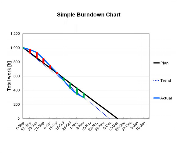
This sample of free simple burn down chart template is a simple template which is simple and easy to follow and neatly depicts three different scenarios. In one single graph, three different line graphs are drawn in three different colors.
The three different graphs represent the planned scenario, the trending situation and the actual situation.
Sample Burndown Chart
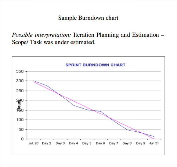
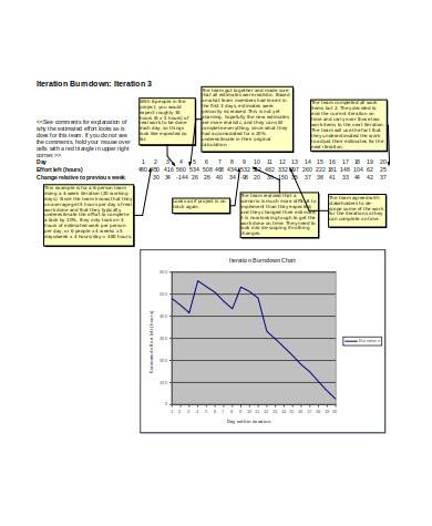
This sample burn down chart is a sample which is meant for predictive analysis to improve iteration planning. This chart provides a good idea about what is a burn down chart and how it can help in predicting a trend.
There are several charts which help to explain the complete process of iteration and measures different tangible aspects of the chart.
Burndown Chart Template PDF
Burndown Chart Scrum
Burndown Chart Template Free Download
General Burndown Chart
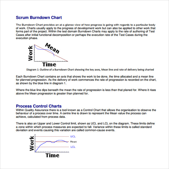
What Is a Burn Down Chart?
A burn down chart is a tool which can be used for measuring the deviation of time and to manage the progress of projects. A burn down chart is often regarded as a great management tool as it helps to provide the stake holders as well as the managers a good idea about the progress of the project. The name is derived from the fact that this Chart Templates depicts how quickly the team is burning down through the needs of the users.
What Are The Objectives Of a Burn Down Chart?
The primary objective of a burn down chart is to provide better planning so that iteration backlog can be smoothed out. It also helps to understand various impediments which are often considered as roadblock for effective utilization of resources. It also helps an effective tool for internal benchmarking which can be used to build printability.
How to Get the Best Results from a Burn down Chart?
If you wish to get the correct answer from a burn down chart, it is important that you feed in very honest data in the chart and place the chart next to the story wall and use a large graph. Make sure the entire team understands the projections between actual delivery and planned delivery so that they can work according to the timeline.
Burnt down charts are regarded as powerful tools which are used to access prediction against progress and also helps the team to understand the inherent project risk. All the charts given in the sample represent various types of data to cater to the needs of various organizations. You can download one of our samples or use them as a reference for creating your own chart.
If you have any DMCA issues on this post, please contact us!
Related Posts
Weekly Schedule Samples & Templates
Contractual Agreement Samples & Templates
FREE 9+ Amazing Sample Church Bulletin Templates in PSD | PDF
Sample Business Card Templates
Sample Cashier Job Descriptions
Questionnaire Samples
FREE 10+ Sample HR Resource Templates in PDF
FREE 10+ HR Consulting Business Plan Samples in MS Word | Google Docs | Pages | PDF
FREE 49+ Sample Job Descriptions in PDF | MS Word
FREE 16+ Nonprofit Budget Samples in PDF | MS Word | Excel | Google Docs | Google Sheets | Numbers | Pages
FREE 13+ Academic Calendar Templates in Google Docs | MS Word | Pages | PDF
FREE 10+ How to Create an Executive Summary Samples in Google Docs | MS Word | Pages | PDF
FREE 23+ Sample Event Calendar Templates in PDF | MS Word | Google Docs | Apple Pages
Company Profile Samples
FREE 10+ Leadership Report Samples [ Development, Training, Camp ]