Whether you are a businessman, student or professional, a Blank Organizational Chart Template can actually help in giving a quick head-start to your flowcharts. It can be used to display different kinds of work-flows right from the beginning to the finish. Available in a multitude of types and categories, blank chart templates provide ready-made design, framework and layout in which you can fill in the required details and print them easily. The charts can be reframed easily and the settings can be adjusted as per your individual requirements and preferences.
Flow Chart Blank Chart Template
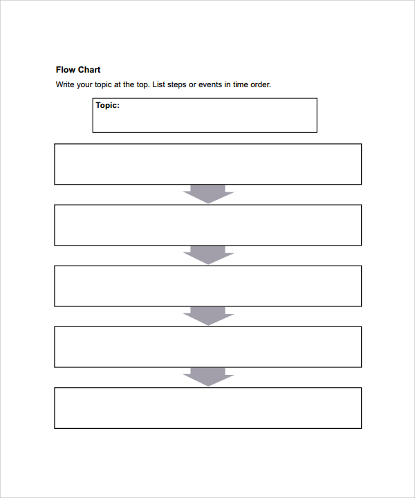
A flowchart represents a sequence of actions or movements of things or people involved in an activity or complex system. It can be effectively used to graphically represent a manufacturing or work process, a logic sequence, organizational chart or a formalized structure. Use a blank chart template to make a flowchart with your desired number of boxes and columns.
Pyramid Blank Chart Template
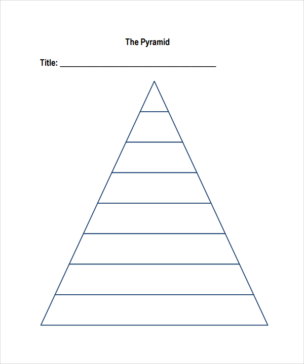
A pyramid chart is a triangular form with lines that divide it into categories or sections. An associated idea or topic is written in each category or section. Because it is triangular in shape, each of its sections is different in size from to others. Each size indicates a hierarchy level among the topics. It can be used to visualize proportional, hierarchical, process steps, foundation based relationships, organizational layers, etc.
Family Tree Blank Chart Template
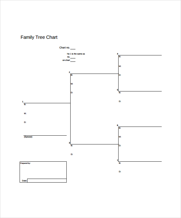
A blank family tree blank chart template is perfect for class projects, genealogy research etc. Each section is divided into many sections and the chart seems to continue till eternity. This kind of template can also be used to indicate an organizational structure or a family structure and more sections can be added further as new members join in.
Pie Chart Blank Chart Template
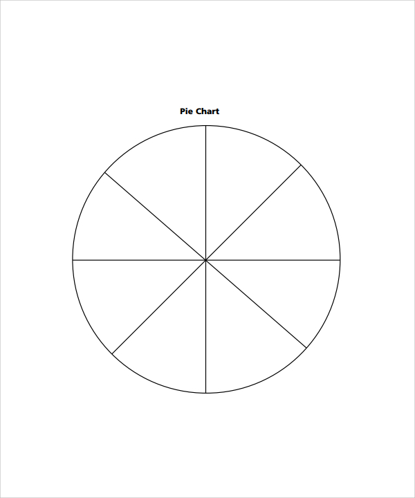
A pie chart is a circle chart that is divided into slices for illustrating numerical proportions. Arc lengths of different slices are proportional to the quantities they represent. It can be effectively used to visualize the results of a survey in percentage. Use a readymade pie chart blank chart template to create a perfect pie chart representation.
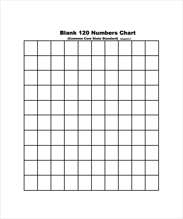
Printable Blank Chart Template
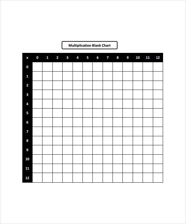
Multiplication Blank Chart Template
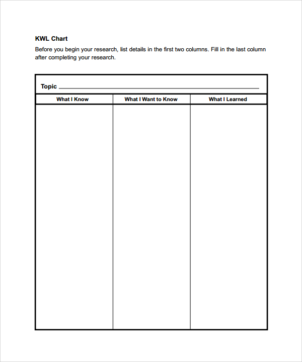
Blank Chart Template Example
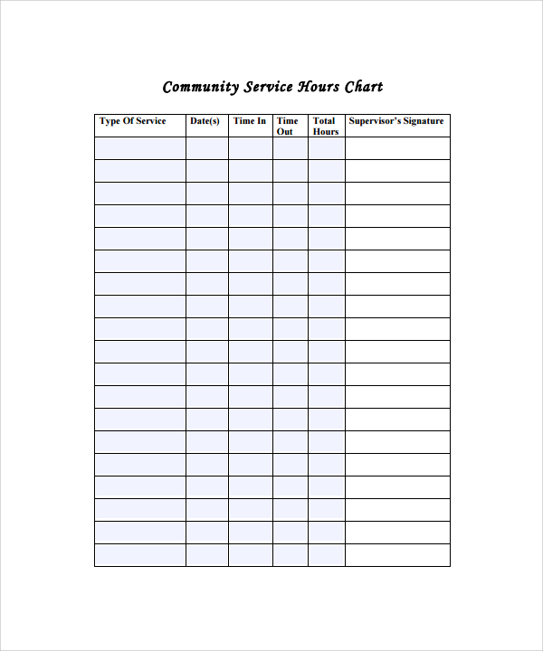
Community Service Hours Blank Chart
Simple Blank Chart
General Blank Chart
Uses of a Blank Chart Template
- A blank chart template can be easily used to create graphical presentations of categories, survey results, family trees etc.
- Use it when you have a data and want to indicate it in a visual representation
- When you want some information to be presented in such a way that it becomes easier to understand
Target Audience of a Blank Chart Template
- Businessmen and workers
- Students
- Team leaders
- Surveyors and researchers
Benefits of a Blank Chart Template
- A blank chart template makes it much easier and faster to make a graphical presentation of your choice
- It has a number of types and categories, which you can choose as per the data available
How to Create a Blank Chart Template
A blank chart template has to be selected as per the requirements of the data available. There are different kinds of data that needs to be represented in different ways. So, the template you choose largely depends on how you want to position your data in the chart. If still confused, you may seek help from a professional expert.
You can easily download an appropriate blank chart template from here, fill in the required details and print it out to show your representation. Each and every section of the chart templates is customizable, whether you want to change the number of rows, columns and boxes, or just their size. A blank chart template can be successfully used to represent data in the graphical way.
If you have any DMCA issues on this post, please contact us!
Related Posts
Weekly Schedule Samples & Templates
Contractual Agreement Samples & Templates
FREE 9+ Amazing Sample Church Bulletin Templates in PSD | PDF
Sample Business Card Templates
Sample Cashier Job Descriptions
Questionnaire Samples
FREE 10+ Sample HR Resource Templates in PDF
FREE 10+ HR Consulting Business Plan Samples in MS Word | Google Docs | Pages | PDF
FREE 49+ Sample Job Descriptions in PDF | MS Word
FREE 16+ Nonprofit Budget Samples in PDF | MS Word | Excel | Google Docs | Google Sheets | Numbers | Pages
FREE 13+ Academic Calendar Templates in Google Docs | MS Word | Pages | PDF
FREE 10+ How to Create an Executive Summary Samples in Google Docs | MS Word | Pages | PDF
FREE 23+ Sample Event Calendar Templates in PDF | MS Word | Google Docs | Apple Pages
Company Profile Samples
FREE 10+ Leadership Report Samples [ Development, Training, Camp ]