
Charts come in different shapes and are used for different purposes. In creating a chart you need to have knowledge about the different chart types so that you will be able to determine if the chart you are going to make is appropriate for the data you have in hand.
Charts come in different shapes and are used for different purposes. In creating a chart you need to have knowledge about the different chart types so that you will be able to determine if the chart you are going to make is appropriate for the data you have in hand.
A pie chart is a type of chart that looks like a pizza pie. This chart including other types of charts are available and can be downloaded online for free. Why go through the hassle of creating your own chart when you can download one easily? So don’t leave without downloading.
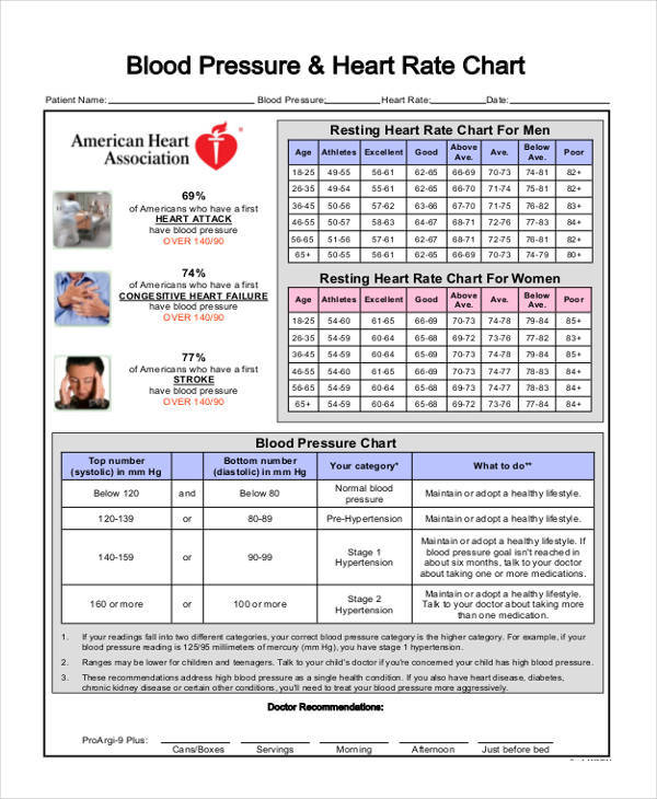
Blood Pressure Rate Chart
Respiratory Rate Chart
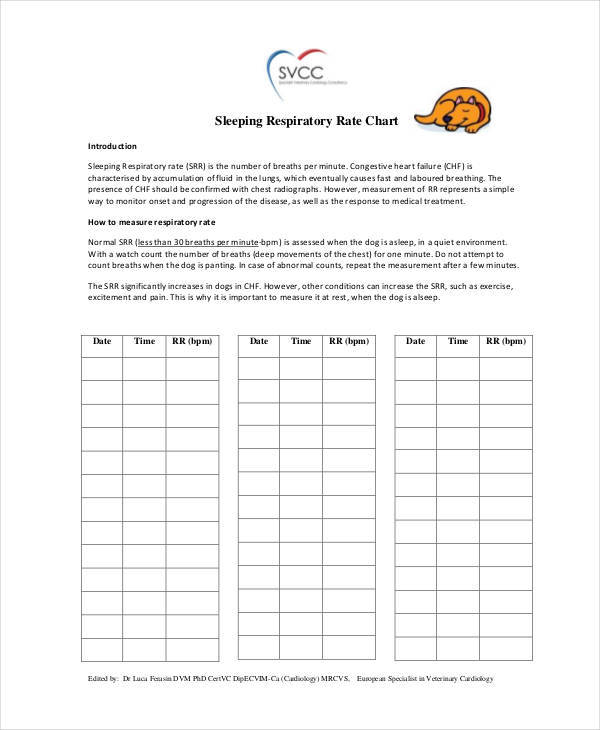
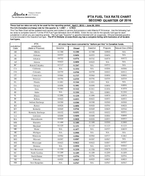
Chart for Tax Rate
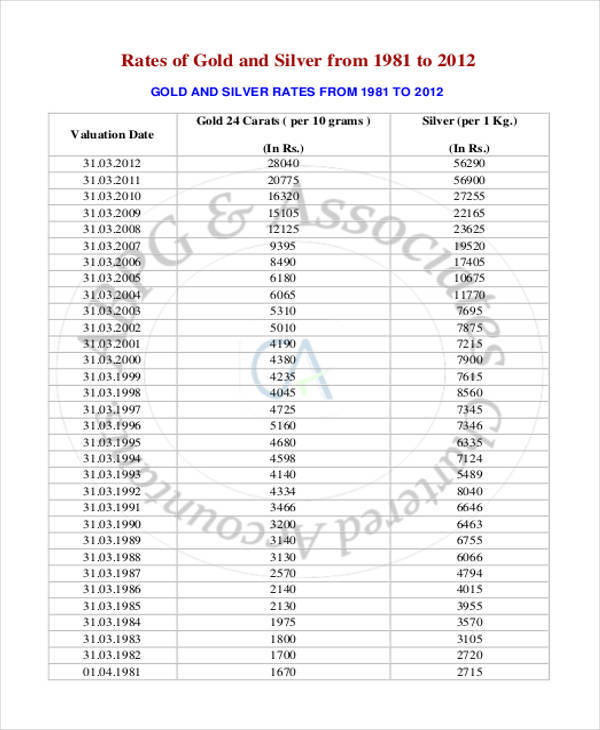
Gold & Silver Rate Chart
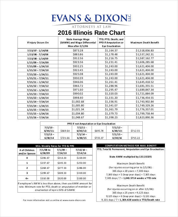
Rate Chart Sample
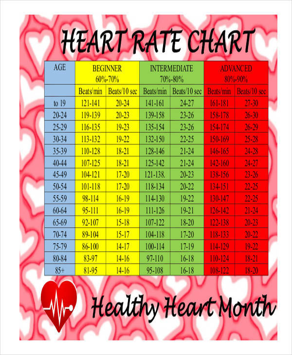
What Is Normal Heart Rate Chart?
Do you know what a person’s normal hart rate is? A heart rate is defined as the number of times a heart beats or pumps blood to the whole body within a minute. A person’t heart rate varies based on the age bracket where they belong. Adults normally have a heart rate of 60 to 100 beats per minute if a person is at rest. Less than 60 and more than 100 means that there is something wrong with them, or they could be doing vigorous activities that altered their heart rate findings. It is important that a person has rested for at least 15 minutes before their heart rate is taken, or you will not have an accurate finding. You might find time charts useful.
How to Calculate Heart Rate Using a Chart?
- Have the patient rest for at least 15 minutes, especially if they have been walking or doing vigorous activities.
- Have a watch ready.
- Asses if the patient is calm.
- Take the patient’s hand and locate a pulse at the wrist part.
- Count the number of beats for a full minute.
- Determine the age of the patient and compare the result to the heart rate chart if it is within normal range.
- Have it recorded in one of our free charts.
Heart Rate Chart
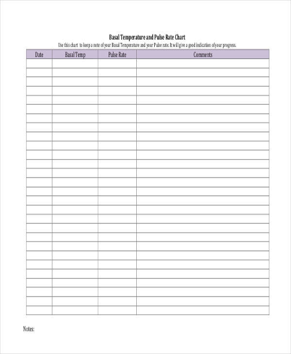
Pulse Rate Chart
Powder Burn Rate Chart
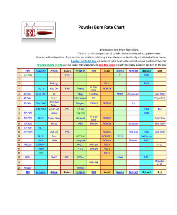
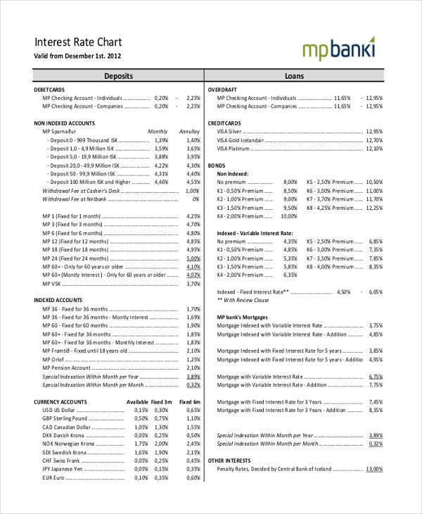
Chart for Interest Rate
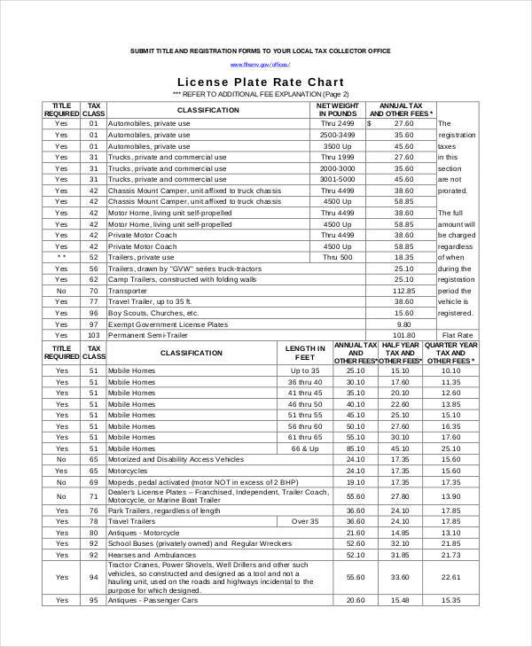
License Plate Rate Chart
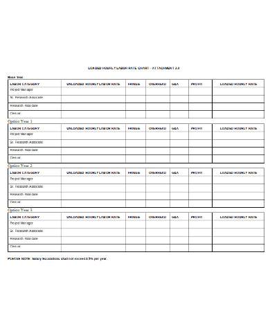
General Labour Rate Chart
Types of Chart
- Bar charts make use rectangular bars whose height represents a particular percentage based on the date provided.
- Line charts makes use of lines and points that go up or down. The dots or points represent the value of the data, and the lines show the up and down trend of the data.
- Pie charts look like pizza pie slices. The portion of each slice represents how big or small the data is.
- A histogram is a type of bar chart that uses numbers for its categories. It is referred to as a combined and continuous data.
You might be interested in powder burn rate charts.
Dos and Don’ts in Rate Charts
- Do put legends in a way that will make your chart look clean and professional.
- Avoid using acronyms or abbreviations. Use the full word instead.
- Do not put a legend to your chart if you only have one data in it.
- Provide explanation on how and why a chart is like that.
- Make it a habit to ask others’ opinion about the chart you have created, or check other printable charts for reference.
- Do review the data you have included in your chart.
- Do not position your chart that makes people tilt their heads.
Related Posts
FREE 10+ Medicine Chart Samples in PDF | MS Word
FREE 10+ Seat Chart Samples in PDF
FREE 10+ Pie Chart Samples in PDF
Free 3+ Eye Color Chart Samples in PDF
FREE 10+ Family Chore Chart Samples in PDF
FREE 10+ Classroom Chart Samples in PDF
FREE 10+ Genealogy Chart Samples in PDF
FREE 10+ Shipping Chart Samples in PDF
FREE 10+ Goal Chart Samples in PDF
FREE 10+ Character Chart Samples in PDF
FREE 10+ Table Seating Chart Samples in PDF
FREE 10+ Classroom Seating Chart Samples in PDF
FREE 10+ Grade Chart Samples in PDF
FREE 10+ Workflow Chart Samples in PDF
FREE 10+ Budget Chart Samples in PDF